Introduction
Institutional and Hedge Fund managers return from summer vacation and adjust their financial portfolios at the end of each summer, causing a selloff pressure in the market. September is considered a bad month for the Bulls [1]
“Given that September tends to be a bad month for the market, I’m urging you to be prepared …” Jim Cramer on CNBC, September 11, 2020.
For this and other reasons, such as election, pandemic, etc., people with trading, investing or retirement portfolios may want to know how their financial portfolios (or instruments such as stocks or ETFs in their portfolios) performed over some years, months, weeks or days. They may also want to know the average (mean) monthly, yearly, weekly or daily returns, starting from some fixed time of start in the past to the present or recent time.
Almost all portfolio managers measure performance with reference to a benchmark [3]. In this short note, we will consider the historical data of the Standard and Poor’s 500 Index (S&P 500, symbol=^GSPC) from Yahoo! Finance, which is widely regarded as the best gauge of large-cap U.S. equities. Other well known benchmarks include DOW-30, NASDAQ-100, and the Russell 2000 Index for small-caps.
We will then outline a simple way to visualize or summarize monthly returns as well as average monthly returns using R. Interested readers can modify the instrument, period and length of time to their preference.
We start by installing the R packages that will be needed to produce libraries later. For more information about one of the key packages used here, the tidyquant package, see [2].
## Load Packages for the libraries that will be needed
##install.packages(c("tidyquant","ggplot2","RColorBrewer","kableExtra"))
Getting and Preparing Data
We will get the data for the S&P 500 Index, symbol = ^GSPC, from Yahoo! Finance. We will then prepare the data for visualization and/or summarization of results as needed.
##Get data
library(tidyquant)
library(timetk)
symbol <- tq_get("^GSPC",from = "1927-12-01", to = "2020-12-31", get = "stock.prices")
symbolname<-"^GSPC" #we need this for reproducible labels of our plot outputs.

##Create a tibble, tb, for ^GSPC Monthly Returns.
tb<-tq_transmute(data=symbol, select = adjusted,mutate_fun = periodReturn, period = "monthly",col_rename = "Return")
This tibble has 1114 rows and 2 columns and you can view the head of the data in any format you wish.
library(kableExtra)
head(tb) %>%
  kbl(caption = "Monthly Returns") %>%
kable_classic(full_width = F, html_font = "Cambria") %>% kable_styling()| date | Return |
|---|---|
| 1927-12-30 | 0.0000000 |
| 1928-01-31 | -0.0050963 |
| 1928-02-29 | -0.0176437 |
| 1928-03-30 | 0.1170337 |
| 1928-04-30 | 0.0243775 |
| 1928-05-31 | 0.0126582 |
To make our work a bit easier, we create new columns of Month and Year from the date column of tb and select only the columns we want in the order of our desire. In addition to returns of each month by year, we will be interested on the average (mean) monthly returns. To that end, we will create new rows for the average monthly returns from the beginning of the data (1927) to the present year (2020).
## Create new Year and Month Columns
tb$Year<-format(as.Date(tb$date), format = "%Y")
tb$Month<-format(as.Date(tb$date), format ="%b")
tb$Month = factor(tb$Month, levels = month.abb) #lists abbreviated months in chronological order when plotting

## Select only the columns we need
library(dplyr)
tb<-select(tb, 3,4,2)

## include a row of average monthly return for each month (in adition to monthly returns since 1927).
agg = aggregate(tb$Return,by = list(month=tb$Month),FUN = mean)
agg$Year<-"Average Monthly Return \n since 1927"
colnames(agg) <- c("Month", "Return", "Year")
agg<-select(agg, 3,1,2)
tb<-rbind(tb,agg)
head(tb)%>%
  kbl(caption = "Monthly Returns and Average Monthly Returns") %>%
kable_classic(full_width = F, html_font = "Cambria") %>% kable_styling()| Year | Month | Return |
|---|---|---|
| 1927 | Dec | 0.0000000 |
| 1928 | Jan | -0.0050963 |
| 1928 | Feb | -0.0176437 |
| 1928 | Mar | 0.1170337 |
| 1928 | Apr | 0.0243775 |
| 1928 | May | 0.0126582 |
The last 12 rows contain the average (mean) monthly returns from the start date of the data to the present year, preceded by the monthly returns of the most recent years. Since this note is written in September of 2020, the 2020 data was only for 9 months at this writing.
tail(tb,n=34) %>%
  kbl(caption = "Monthly Returns and Average Monthly Returns") %>%
kable_classic(full_width = F, html_font = "Cambria")| Year | Month | Return |
|---|---|---|
| 2018 | Dec | -0.0917769 |
| 2019 | Jan | 0.0786844 |
| 2019 | Feb | 0.0297289 |
| 2019 | Mar | 0.0179243 |
| 2019 | Apr | 0.0393135 |
| 2019 | May | -0.0657777 |
| 2019 | Jun | 0.0689302 |
| 2019 | Jul | 0.0131282 |
| 2019 | Aug | -0.0180916 |
| 2019 | Sep | 0.0171812 |
| 2019 | Oct | 0.0204318 |
| 2019 | Nov | 0.0340470 |
| 2019 | Dec | 0.0285898 |
| 2020 | Jan | -0.0016281 |
| 2020 | Feb | -0.0841105 |
| 2020 | Mar | -0.1251193 |
| 2020 | Apr | 0.1268440 |
| 2020 | May | 0.0452818 |
| 2020 | Jun | 0.0183884 |
| 2020 | Jul | 0.0551013 |
| 2020 | Aug | 0.0700647 |
| 2020 | Sep | -0.0576663 |
| Average Monthly Return since 1927 | Jan | 0.0123258 |
| Average Monthly Return since 1927 | Feb | -0.0011168 |
| Average Monthly Return since 1927 | Mar | 0.0041122 |
| Average Monthly Return since 1927 | Apr | 0.0140813 |
| Average Monthly Return since 1927 | May | -0.0004602 |
| Average Monthly Return since 1927 | Jun | 0.0075405 |
| Average Monthly Return since 1927 | Jul | 0.0159214 |
| Average Monthly Return since 1927 | Aug | 0.0070290 |
| Average Monthly Return since 1927 | Sep | -0.0105286 |
| Average Monthly Return since 1927 | Oct | 0.0046096 |
| Average Monthly Return since 1927 | Nov | 0.0074612 |
| Average Monthly Return since 1927 | Dec | 0.0129007 |
Visualizing the tidy data
We can now visualize the data to our liking. For example, a column plot (bar plot) of monthly returns during the most recent five years (four years and nine months since this note was written in September) with a plot of average monthly return (since 1927) of each month at the bottom may be done as follows.
## Plot using ggplot2
library(ggplot2)
library(scales)
g<-ggplot(data=tb[(length(tb$Return)-(6*12)+4):length(tb$Return),], aes(x=Month, y=Return))
g<-g+geom_col(aes(fill = Month), position = "dodge")
g<-g+facet_grid(rows = vars(Year))
g<-g+labs(title=paste("Monthly % Returns of", symbolname),subtitle="With % return stamped on top/bottom of each bar")
g<-g+geom_text(aes(label = paste(round(Return*100,1), "%"), vjust = ifelse(Return >= 0, -0.1, 1.1)), size=3.5)
g<-g+scale_y_continuous("Returns in Percentage", labels = percent_format(),expand = expansion(mult = c(0.2, 0.2)))
g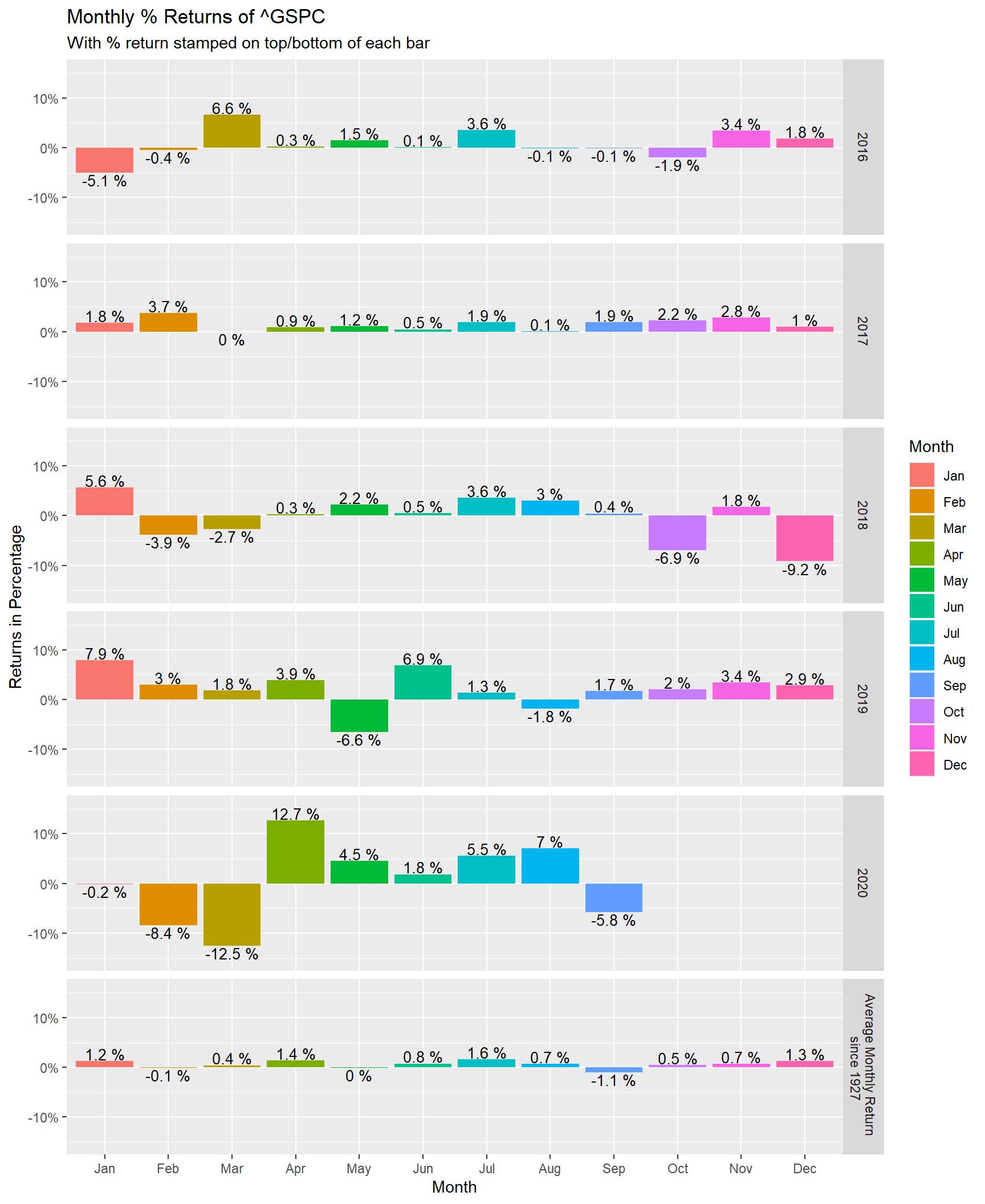
If we are interested in a separate plot for the average monthly return of each month (from 1927 to the present day), we can select the last 12 rows of tb and use the same code. We also need to adjust the title and labels of the axes.
## Plot using ggplot2
library(ggplot2)
library(scales)
g<-ggplot(data=tb[(length(tb$Return)-12+1):length(tb$Return),], aes(x=Month, y=Return))
g<-g+geom_col(aes(fill = Month), position = "dodge")
g<-g+facet_grid(rows = vars(Year))
g<-g+labs(title=paste("Average Monthly % Return of", symbolname),subtitle="With AMPR  stamped on top/bottom of each bar (data since 1927)")
g<-g+geom_text(aes(label = paste(round(Return*100,1), "%"), vjust = ifelse(Return >= 0, -0.1, 1.1)), size=3.5)
g<-g+scale_y_continuous("Average (Mean) Monthly Return", labels = percent_format(),expand = expansion(mult = c(0.2, 0.2)))
g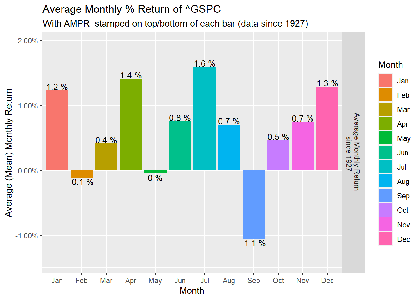
Summarizing other interesting tales
There were several interesting market events in history. Interested readers may use codes and data to get summary of results in the format of their liking. For example, if we are interested in the list of the fifteen worst days of the S&P 500 Index, we can run the following chunk.
symbol2 <- tq_get("^GSPC",from = "1927-01-01", to = "2020-12-31", get = "stock.prices")
tb2<-tq_transmute(data=symbol2, select = adjusted,mutate_fun = periodReturn, period = "daily",col_rename = "Return")
tb2<-tb2[order(tb2$Return,decreasing = FALSE),]
tb2$Return<-paste(round(100*(tb2$Return),1),"%")
head(tb2, n=15) %>% kbl(caption = "Worst historical days of market") %>% kable_classic(full_width = F, html_font = "Cambria")| date | Return |
|---|---|
| 1987-10-19 | -20.5 % |
| 1929-10-28 | -12.9 % |
| 2020-03-16 | -12 % |
| 1929-10-29 | -10.2 % |
| 1935-04-16 | -10 % |
| 1929-11-06 | -9.9 % |
| 1946-09-03 | -9.9 % |
| 2020-03-12 | -9.5 % |
| 1937-10-18 | -9.1 % |
| 1931-10-05 | -9.1 % |
| 2008-10-15 | -9 % |
| 2008-12-01 | -8.9 % |
| 1933-07-20 | -8.9 % |
| 2008-09-29 | -8.8 % |
| 1933-07-21 | -8.7 % |
Readers who are curious about those historical days may consult the literature. For example, the infamous day 1987-10-19 happens to be what is known in market history as the Black Monday. The crashes in October of 1929 signaled the beginning of the Great Depression. See, e.g., [4].
Readers interested in similar or more interesting results that may be checked using (R-) codes may consult Hirsch’s book [1].
References
[1] Jeffrey A. Hirsch, Stock Trader’s Almanac 2020 (Almanac Investor Series), 16th Edition, ISBN-13: 978-1119596295.
[4] S. Nations, C. Grove, et al., A History of the United States in Five Crashes: Stock Market Meltdowns That
Defined a Nation, William Morrow (Publisher); 1st Edition, June 13, 2017.